
 English
 Deutsch
Product Color Variations Without Reshooting: Options
November 13, 2026
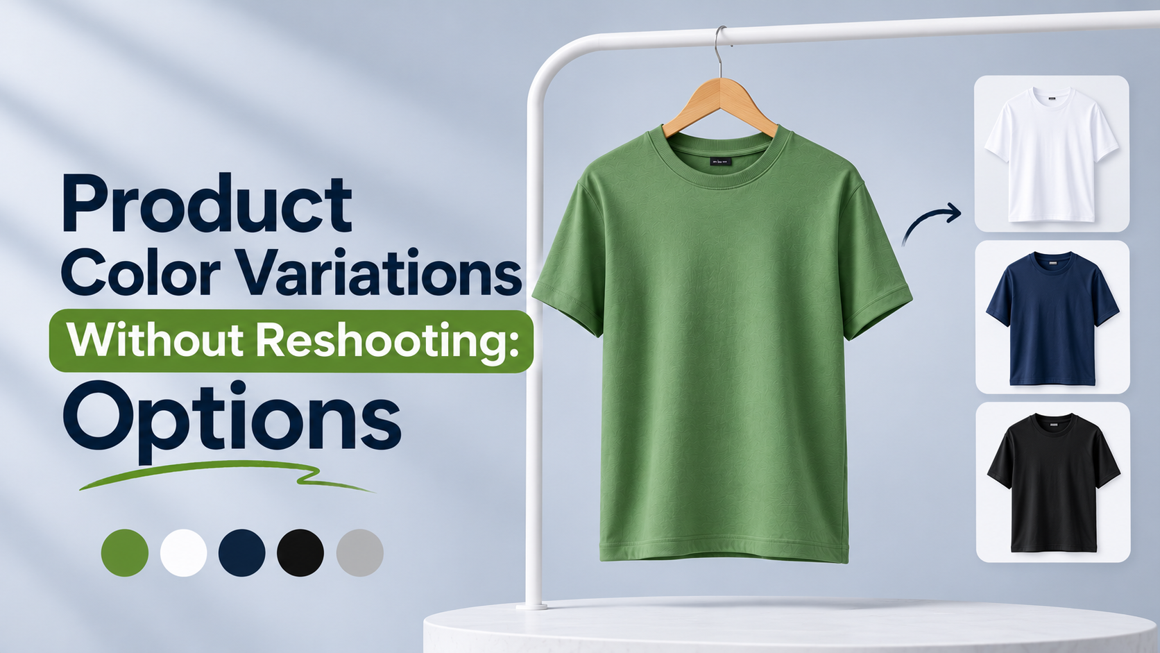
A single product often comes in many colors, and every color needs its own images. Reshooting each one is slow and expensive. Waiting for a new shoot delays the launch. Many brands look for a faster way to show every colorway.
The good news is that you rarely need to start from scratch. With a well-lit master shot and careful color work, you can create accurate colorway images from one photograph. The challenge is doing it without losing texture, shadow, or the true color of the fabric.
This guide compares the main options: creating every colorway from one master shot, recoloring through retouching, and generating colors with AI. It also covers how to keep texture and color accuracy when checking against fabric references.
Why Colorway Images Are Hard to Get Right
Color is one of the most important factors in a purchase decision. A color that looks slightly off on the product page often becomes a return.
Color changes are more than a simple swap. Fabric responds to light differently depending on its dye, finish, and weave. A satin navy and a matte navy can look very different even when the hue is the same. A simple color fill can flatten those differences.
Shadows and highlights also carry color information. If a recolored garment loses its shadow tones or highlight sheen, it can look plastic or unreal.
Consistency across colorways matters too. Customers compare colors side by side, so each variant should follow the same lighting, crop, and finish as the others.
Option 1: Create Every Colorway From One Master Shot
The most efficient starting point is a single master photograph shot in neutral, accurate lighting. The master provides the form, texture, shadows, and highlights. Colorways are built from it.
This approach works best when the product is a single material and the color changes are relatively simple. It also requires a reference for each color, such as a physical swatch or a fabric sample photographed under the same light.
The master shot should be shot with a color reference card or grey card in frame, so the editor has a neutral baseline. It should also avoid colored reflections from surrounding objects, since those can carry into the recolored versions.
Option 2: Recolor Through Retouching
Retouching recolor is a hands-on method. An editor selects the garment or product, adjusts hue, saturation, and lightness, and preserves the original shading. Done well, the result keeps texture and depth because the underlying luminance is kept intact.
This method is generally more controllable than generation. Each colorway can be matched against a physical sample. Editors can adjust specific areas, such as trim, hardware, or stitching, independently.
The trade-off is time. Each colorway still requires careful work, especially for complex materials, mixed fabrics, or products with reflective surfaces. Metallic finishes and sheer materials are the most challenging.
Option 3: Generate Colors With AI
AI generation can produce colorway visuals from a master image and a text or reference prompt. It can be quick and useful for exploring options, especially for concept testing or early previews.
However, AI-generated colors need careful checking. The generated color may drift from the physical sample, and the fabric texture may change. AI can also invent sheen or shadow patterns that do not match the real material.
For commerce, AI colorways should be treated as a starting point. Before publishing, compare each generated color against a physical swatch under neutral light. Retouching is often needed to bring the color and texture back in line.
Comparing the Three Options
Each method fits a different situation.
Master shot with recolor works well for consistent materials, large color ranges, and brands that need accuracy across the catalog. It offers strong control and predictable results.
Retouching recolor is best for products where precise color matching matters and where each variant needs individual attention. It takes longer but gives high accuracy against physical references.
AI generation is useful for speed, concept testing, and early visuals. It needs a verification step before going live, especially for color-critical products.
Many brands combine them. They shoot a master, use retouching for accurate live colorways, and use AI to explore unreleased or experimental options.
Keeping Texture and Color Accuracy
Accuracy depends on how the color is checked, not just how it is created.
Use physical references. Keep a fabric swatch or sample for each color. Compare the image to the swatch under neutral daylight-balanced light, not on a screen alone.
Calibrate the display. Editing on an uncalibrated monitor leads to color errors that customers will see. Calibrate before making color decisions.
Preserve luminance. Keep the original shadow and highlight structure. If the recolor changes the brightness pattern, the fabric will look flat.
Check texture at full zoom. Weave, knit, sheen, and stitching should look natural. Smoothing that removes texture is a common mistake when colors are adjusted.
Match the set. Compare each colorway next to the others and the main image. Color should feel like a family of the same product.
Colorway Accuracy Checklist
- Master shot includes a grey card or colour reference
- Each colorway has a physical swatch or reference
- Swatch comparison done under neutral daylight-balanced light
- Monitor is calibrated before color decisions
- Shadows and highlights are preserved in every colorway
- Fabric texture and sheen look natural at full zoom
- Trim, hardware, and stitching colors are checked separately
- Colorways match each other in lighting, crop, and finish
- AI-generated colors are verified against physical samples
- Final colorways are reviewed before publishing
FAQ
Q: Can one photo really be used for every color?
A: Often, yes, if the master shot is well lit and the material is relatively consistent. Simple fabrics and solid colors recolor more easily. Complex materials, metallics, or products with mixed trims may need more individual attention or a separate shot.
Q: Is AI a reliable way to create colorways?
A: AI can be useful for exploring colors and previews. For commerce, the generated colors should always be checked against physical samples because the hue, texture, and sheen may not match the real product. Treat AI output as a draft that needs verification.
Q: How do I keep a recolored image from looking fake?
A: Preserve the original shadows, highlights, and texture. Avoid flat color fills that remove depth. Check the image at full zoom and compare it against a physical sample. A good retoucher adjusts color while keeping the structure of the original photo.
Q: What should I send to a retoucher for colorway work?
A: Send the master shot, a physical swatch or clear photo of each target color, a grey card or reference image if available, and any notes about trims, hardware, or finishes that should stay unchanged. A clear brief reduces revisions and keeps colors consistent across the set.
Creating colorways without reshooting is practical when the master shot is strong and the color work is careful. Recoloring through retouching gives the most control for accuracy, while AI can speed up exploration when every result is verified against the real product. Choose the method that fits each product and keep texture, shadow, and color consistent across the set. If you want help producing accurate colorway images from your master shots, explore our color correction service and send a few products for a test batch.


